#applicationdesign
#redesign
#mobile
#Figma

Concept:
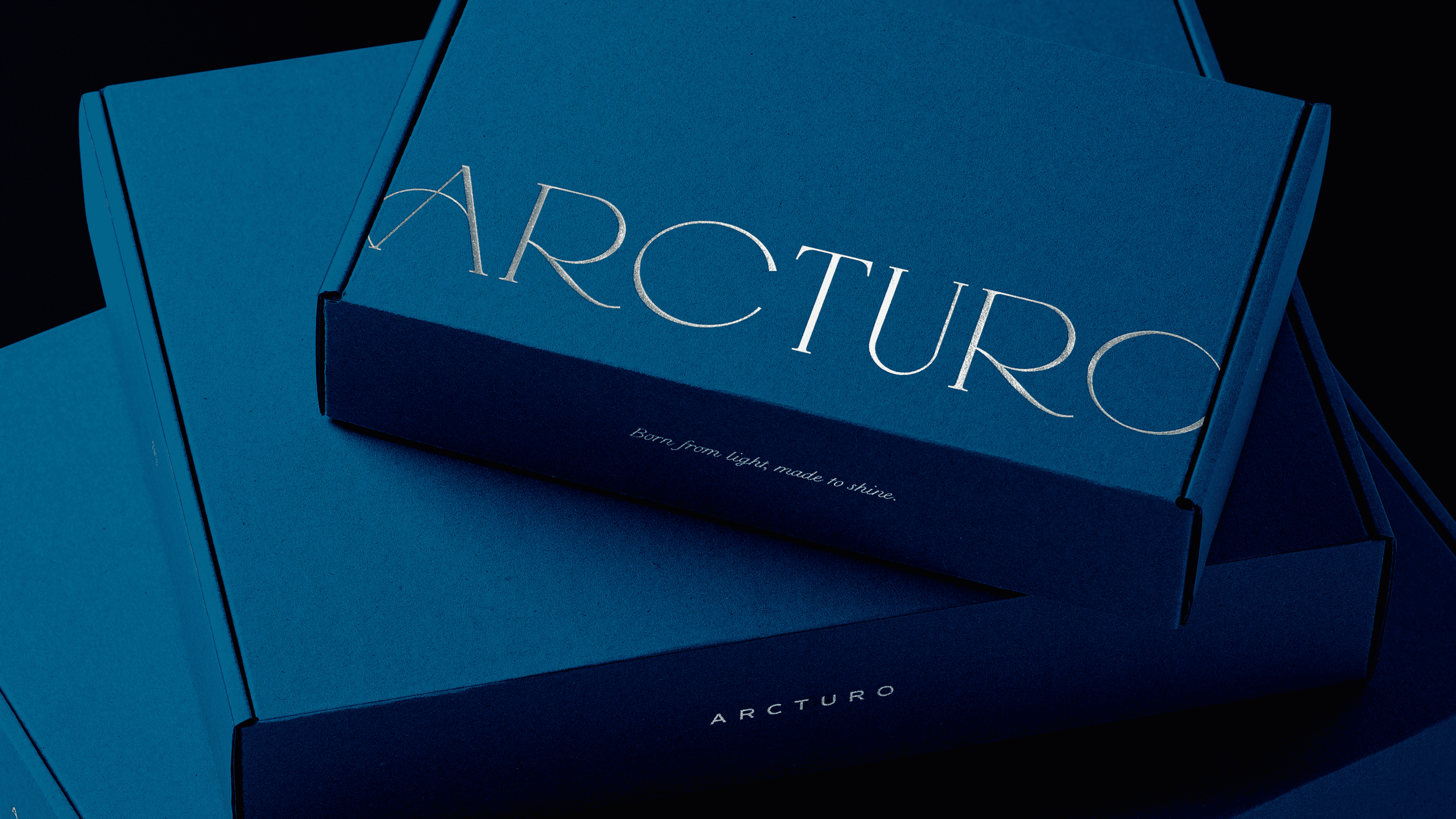
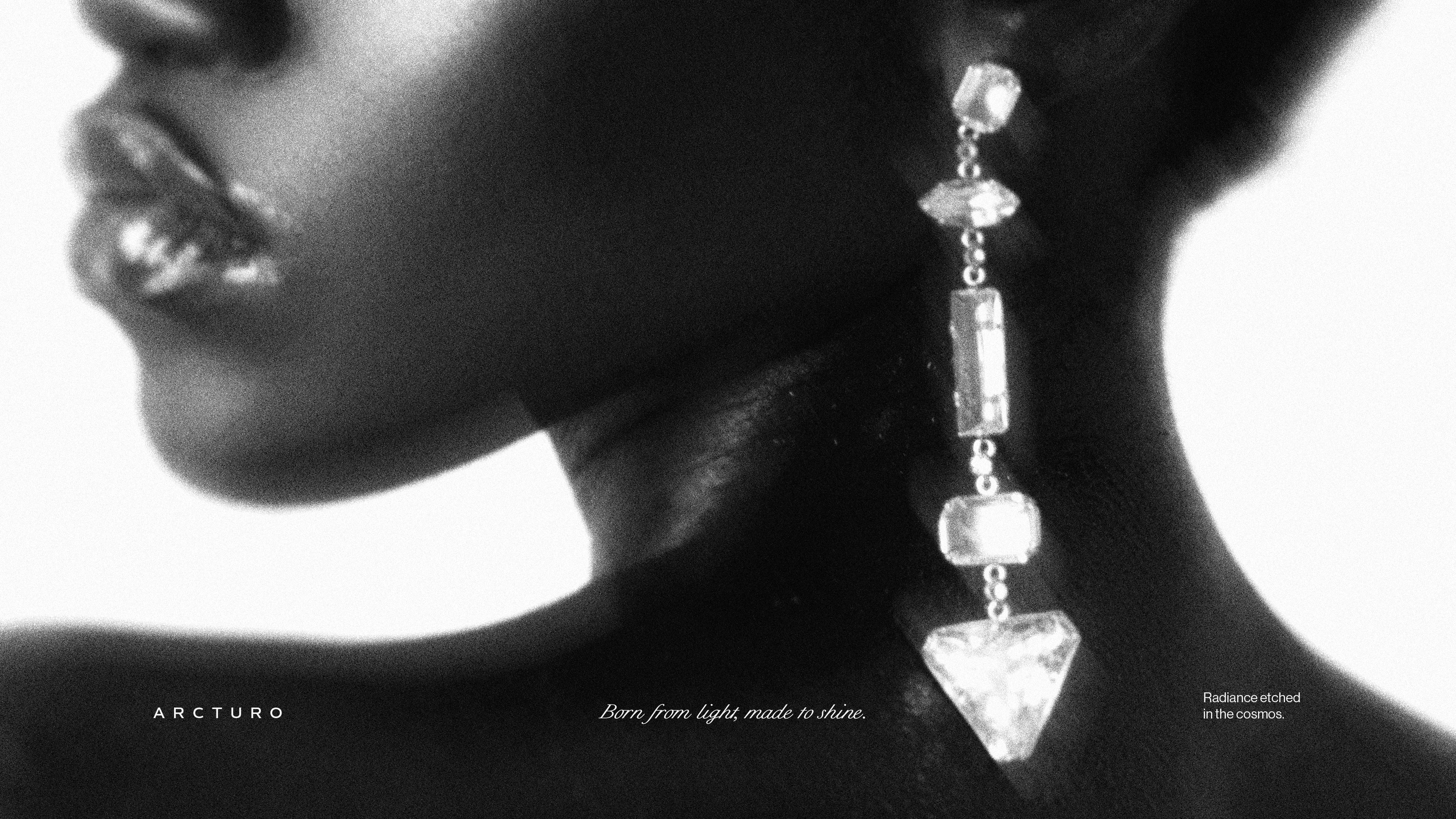
Arcturo was conceptualized as a celestial compass—a guiding force for those seeking beauty with intention. Drawing inspiration from constellations and the guiding star, the brand transforms jewelry into symbolic artifacts of direction, serenity, and self-expression.
Visual Identity System:
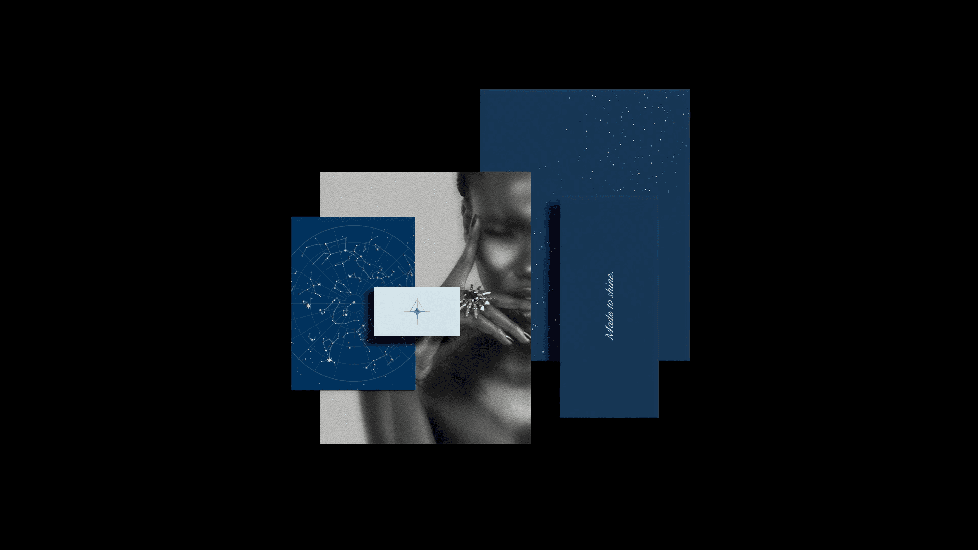
Symbol: A custom mark intertwining a guiding star with the ethereal qualities of celestine stone, representing clarity, direction, and calm
Typography: Refined serif typography that balances modern sophistication with timeless elegance
Graphic Language: Star maps, constellation motifs, and cosmic references used as storytelling elements
Textures & Patterns: Delicate stippling inspired by the night sky, adding depth and celestial atmosphere
Experience Design:
Every touchpoint from jewelry design to visual branding, reinforces the idea that each Arcturo piece is a personal universe, transforming adornment into a meaningful expression of identity and wonder.


Arcturo emerges as a brand that doesn’t just sell jewelry, it offers an experience rooted in story, symbolism, and cosmic elegance. The identity system creates emotional resonance while maintaining a premium, minimalist aesthetic, positioning Arcturo as a timeless luxury brand for modern seekers.
Adobe Illustrator
Adobe Photoshop